
Overview
Reply.ai creates automated self service tools for their clients, providing a base tool with modifications for different, companies, products, and brands.
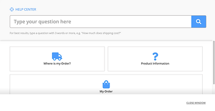
We designed an adaptable Help Center for Reply.ai, focused on providing users with a clear customer support experience to reduce customer frustration.
My role
UX Researcher, UX Designer, Scrum Master
Platform
Responsive Website
Year
Spring 2020
the UX challenge
Customers seek out help when they’re frustrated about the service, but they become even more frustrated because interacting with customer support can be difficult. We need to understand the consumer’s needs and issues, our client’s needs and issues and how the existing help center can improve.
How might we provide customers with a simple and streamlined way to receive the information they are looking for?
our UX process
Our process for this project focuses heavily on research and testing. Since Reply.ai builds Help Centers for other companies, our goal is not to provide a specific design, but rather, to provide guidelines that will inform each custom design. These guidelines will be backed by research and user feedback.

the outcome
Since this product changes from company to company, we decided the research was more valuable than any mockup. We took detailed notes on each interaction. We provided Reply.ai with user data that was both verifying and surprising. Along with our research report and detailed testing notes, we provided a list of "best practices" and annotated screens. These documents highlighted each element in the interface along with user-backed guidelines on their design.
personal takeaways
Designing a customizable Help Center was definitely a challenge. I learned the value of good information architecture. Users expected to find FAQs about a task, while doing the task. I learned the value of flexible design elements. We needed to consider the balance between button size and its varying content, as well as, button layouts that could accommodates the needs of different help centers.
Research
discuss product & business goals
After some initial research, we met with our client to discussed the goals, product requirements and expectations of this project. We worked together in design.

Consider a customizable interface that can adjust to different brands.

Deflect tickets by providing easier, clearer, faster information.

Provide feedback form to find areas of growth for the Help Center.
understand user needs and frustrations
We needed to understand the habits and needs of our target users. We conducted eleven interviews with customers who have online shopping experience who are familiar with help pages and customer service.

“I had to wait on the phone without knowing how long it was going to take. It was very frustrating. ”
“If you have to wait for a very long time to get a response or don't get it immediately, you might just forget about it. ”
“[Contacting customer service] is really annoying and long, and convoluted, they just put you in through circles.”
“I’ll only respond to customer feedback if it’s quick and easy or basically right in front of me already”
our typical user
We created a personification of our insights from user interviews in the form of a persona. Sara the Shopper helps us focus our design by allowing us to prioritize our features for her needs.
Sara the Shopper
Sara is a 31 year old real estate agent that enjoys online shopping because it's convenient and quick. She shops very frequently and needs a quick resolution to her issues and questions. She hates long wait times with customer support and when she has too many steps to return an item.
Evaluation
exDemo evaluation
We were given a demo to start with, so we tested it with our target users, hoping to understand what is working and not working as well as our users’ thought process.
heuristic evaluation
We completed a heuristic evaluation on the main navigation pages and FAQ pages to further understand what aspects of each page was successfull and which needed more work.
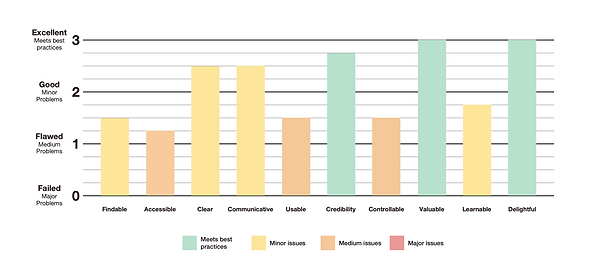
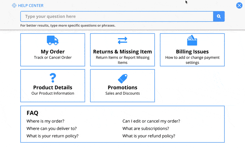
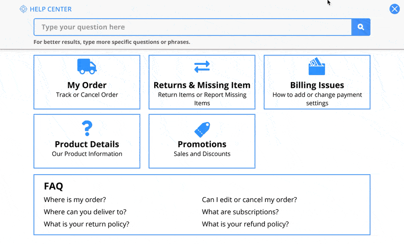
The minimalistic layout makes the Help Center clear and easy to follow. However, the Help Center is not very accessible, usable and controllable. There are several pages where the text is small and difficult to read for visually impaired users. Many buttons have vague names and some buttons take you pages you wouldn’t expect.
usability testing of existing site
We tested the existing Help Center with seven users, exploring the existing features to understand if the users can easily accomplish tasks.

-
Users found site helpful, clean, and simple to use, but needs bigger font
-
“Not what you are looking for?” button didn’t translate to sending a ticket
-
Some confusing categories names like product information
-
Some subcategories and FAQ answer titles were unclear
-
Users noticed icons of buttons before the button itself — fun and inviting
initial research overview
Having completed our initial research and evaluation, we looked at our business requirements, user data, and existing prototype data to create these guidelines as we move into design.
-
Layouts must be clean/ simple with more visible text
-
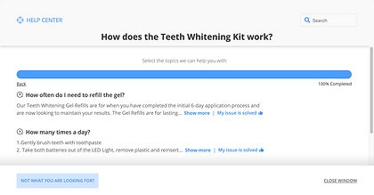
Return and missing item report process must be streamlined
-
Icons/ labels must be short, concise, and clear
-
Customer service button should be available but not too available
-
Feedback must be simple and quick with clickable icons
Design
define the minimum viable product
Informed by our research, our design process begins by defining which features are necessary for launch and which features would be nice to have in future iterations.

We used a feature prioritization matrix to compare our possible features based on how essential they are and how much effort they will be to develop

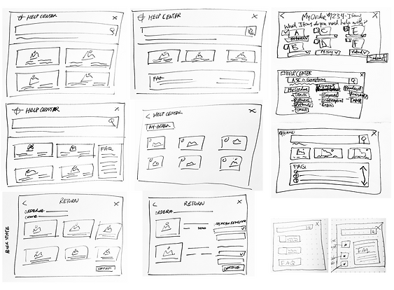
design studio
Our client joined us for a few rounds of design studio, where we quickly sketched our designs for different screens. He provided his business perspective and we kept our user's needs for a clear and simple interface in mind as the main driving force.
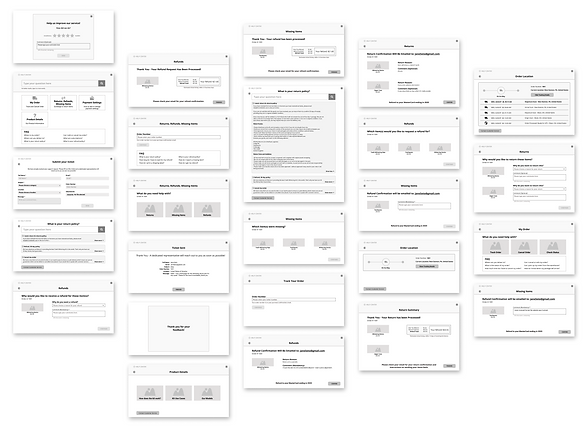
mid-fidelity design
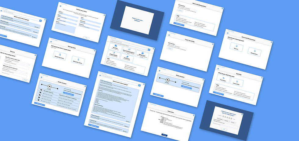
We then took our sketches and formalized a mid-fidelity prototype. Overall, we focused on a clean organized layout, renamed and relabelled buttons and including a returns, missing items and refunds feature.
Evaluate
usability test of mid-fi prototype
We tested new users with the same three tasks from our initial round of testing to observe deltas in our quantitative results. We also tested our new features with three new tasks.

key takeaways
Overall, our design changes for the first three tasks were not as effective as we would have liked. However, our new features were very successful. Many users actually submitted feedback when they exited the Help Center for task 6! More importantly, we obtained some great insights on how our users responded to each design decision and what they were hesitant about.
-
Users still had trouble locating the submission form
-
Homepage scrolling is suboptimal to view the FAQ’s
-
Users didn’t like the unbalanced design of the category icon boxes
-
There was confusion between “Track an Order” and “Status Order”
-
Users liked the automatic one-click feedback request pop-up
-
Some users didn’t like that “refund” was the only choice for “missing items”
-
Some confusion between the “Returns” action button and the “return policy” FAQ
Design
hi-fidelity design
We redesigned our prototype based on the feedback we received. We relabeled problematic buttons, added a resend option for missing items, and reduces pages that required scrolling.

Evaluate
usability test of hi-fi prototype
We tested our desktop web design with a new group of users using the same six tasks.
Click below to explore the six tasks

Your package hasn’t arrived yet, please find its most recent location, including the time & date.
Please find the rules about sending this item back to the company.
Please exit out of the “Help Center” so that you’re back at the company’s home page.
Your package hasn’t arrived yet, please find its most recent location, including the time & date.
This round was a resounding success! Almost every task saw an improvement in each metric.

key takeaways
Our users enjoyed our design. It is simple. It is streamlined. And it is familiar, therefore understandable.
-
Users liked the streamlined process for returns and missing items
-
Users enjoyed the options of resending the item or just getting a refund
-
Action buttons at the top of the “Help Center” and FAQ’s at the bottom worked
-
Users confused the functions of the “Returns & Missing Items” action button with the FAQ link
-
Many users wouldn’t leave feedback for automated "Help Centers" unless something very notable happened
-
Users thought that the “Report an issue” button was a method to report “technical issues”
-
Most users would leave quick feedback using the 5-star rating icons and one-click feedback buttons
Handoff
moving forward..
We're confident that our redesign is a better solution for Reply.ai, their clients, and their clients' customers.
We provided our client with a detailed report of our design process and testing results. We also provided a list of "best practices" and key performance indicators to evaluate the product's success as they launch the Help Center.
style guide
We provided our client with all of our screens through Zeplin, as well as, a style guide and our prototype. This will guide the developers as they code our design for their expected launch in November 2020.

best practices
Since this product changes based on the client’s specific brand and FAQs, we decided to provide a list of “best practices” which are essentially user data backed suggestions.

key performance indicators
Some important metrics to keep in mind are the following:
-
decreased number of customer tickets created compared to total number of customers using the Help Center
-
decreased number of phone calls to customer service
-
decreased average time spent in the "Help Center"
-
increased positive customer feedback & ratings
-
Increased number of completed returns & missing items using the Help Center