Spekit: Progressive Learning
Track where you are in your learning journey

What is Spekit?
Spekit is a B2B web application and chrome extension where manager can create documents and other resources that can be referenced by anyone in their organization, on any website and through a chrome extension. A primary use case for the app is onboarding new employees.
My role
UX Researcher, UX Designer
Platform
Responsive Website and Chrome Extension
Project Overview
We designed a way for new employees receive content that’s curated specifically for them, by their managers, when they first log in. The goal is to increase retention by showing the value that Spekit provides.
the UX challenge
There was a 37% drop-off between first time login and first time performing an action in our app. In order to increase retention, we needed to research the opportunity to see where we can increase the value.






Learnings
Sometimes, good ideas are so big that an MVP would take 6+ months. In those cases, we should consider splitting the MVP into smaller releases and design those releases to provide value to the user while building towards the larger MVP.
As product people, emergencies happen and I’ve learned ways to quickly shift focus to new projects while minimizing loss of work from lower priority projects. I’ve had to juggle multiple projects simultaneously.
Research
known painpoints
We already documented a few first-time user experience pain points from past feedback and collaborating with our customer success team.
End-users
-
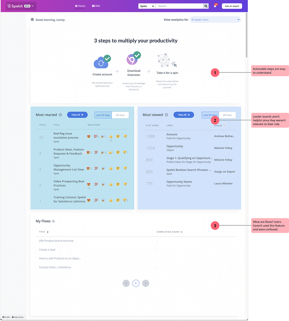
Current dashboard wasn’t helpful or relevant to new users
-
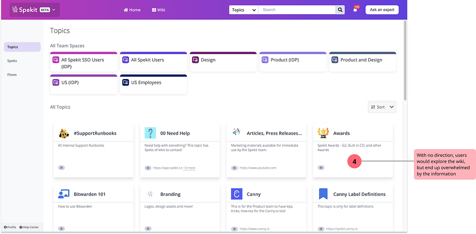
New users were overwhelmed by the wiki
-
Relevant content wasn’t delivered to new users
-
Some users didn’t know the importance of downloading our chrome extension
user research
We interviewed 10 newly hired internal employees. We observed how they interacted with our existing platform when they first logged in.
findings - existing first time user experience
observed typical user flow
Typically, these new hires just clicked around, but didn't find anything relevant enough to read or do.

understanding the user journey
It was clear that new users wanted more guidance when they first logged in. We needed some way to highlight content that’s relevant to the user. We began thinking of ideas like:
-
Update “3 steps to multiply your productivity”
-
Step-by-step product onboarding checklist
-
Create a “learning path” where admin can assign Spekit content, PDFs, links to websites, etc.
-
Assign and track 1 topic

Design
collab with devs and business stakeholders
We created quick sketches and low-fi prototypes to discuss a few ideas with our developers. It helped to get a clearer understanding of the feasibility and timeline of each approach.
We discussed the pros and cons of each idea with our stakeholders.

the BIG idea
As a result, we landed on the idea of a learning path.
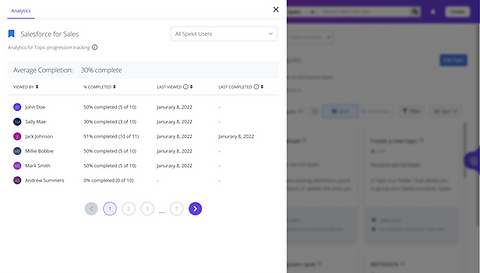
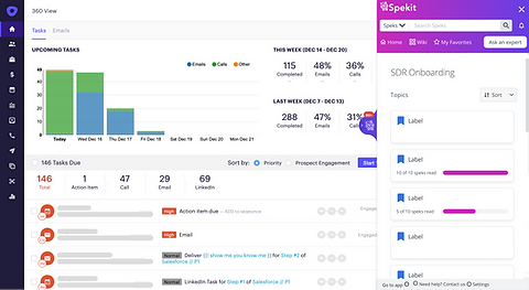
Learning path: A progression of topics, curated by a manager, for an end user to read (ie. "Week 1 Sales onboarding" contains topics important to learn in the 1st week of Sales training). Progress would be tracked and be visible to both employee and manager. This could potential grow to include different content types Spekit provides.
the problem with the idea
The idea everyone liked was too big. It needed too many API's that we had to build from scratch and would take 8+ months.
We needed to:
-
create a new product called a “learning path” that could be assigned and tracked
-
create the ability to assign content and track if that content has been read
-
create a way to manage the permissions between different content types at the same time (this alone would take 2 months for our BE developers)
-
provide new analytics for our customer admin
mid-fi prototype and customer feedback
We put together a mid-fi prototype and met with 5 customers to get their feedback. We wanted to understand the most impactful parts and any pain points that they anticipate.

findings
-
Viewing permissions can get complicated. Each topics has a unique set of viewing permissions, if a Learning path is a parent to the topic, how will the viewing permissions be defined?
-
The concept of a "learning path" is complicated
-
Managers are hesitant to add a new content type to manage
a small change with big impact
Instead of introducing a new content type, Learning paths, we decided to make Topics assign-able. This eliminated many complexities since we're building off of existing content.

second (current) iteration


dev estimates
My team had a series of meetings where we discussed how we would prioritize the features and divide this project into phases.
-
Tracking progress (2 sprints)
-
Assigning topics to a dashboard (2 sprints)
-
Advanced targeting (tbd)
-
Set a due date (tbd)
-
Ability to customize topic order (tbd)

validate this plan with customers
With a plan set, we wanted to get feedback from our customers. We updated our mock-ups and prototypes for phase 1 and 2. The goal of this research was to understand if these releases met our customers’ needs.

findings
We spoke to 11 customers. 10 were excited about the feature. 6 asked to be a part of our beta.
We received a few suggestions that will be considered in future sprints.
-
This feature would automate our customers’ onboarding checklist
-
Visibility into where individuals are with onboarding is key
-
Users want the ability to change the order that topics appear “logical sequence”
-
Admin want the assignments to be automated for new hires, assign periodically to reinforce knowledge
-
Admin want to be able to customize assignments, assign to teams, users, based on tenure, etc.
-
Some users should have viewing permissions but not be required/ assigned
documentation and design system
In order to ensure this feature was built as designed, we documented all behaviours and micro-interactions that were important to the product. We also documented changes and additions to our design system.
sample of design system documentation

a shift in priority
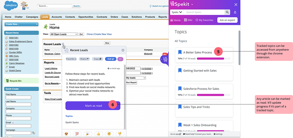
Halfway through the development of phase 1, an urgent issue caused our priorities to shift away from this project. Luckily, the majority of what was built enabled marking content as read - a highly requested feature on it’s own. Our team met and decided this would be our initial release.
A benefit of releasing this feature early is for users to start marking content as read. We can start collecting this data for when the main feature is released.
1st release: Mark as Read
Users can now mark any Spek/ content as read, whether it's in the chrome extension, webapp wiki or pop-ups on other websites.


Next steps
the launch and next steps
As of June 2022, we’ve launched the mark as read feature and the rest of phase one is under development.
Next steps would include:
-
discovery work on advanced targeting
-
research if customers understand the separation of “has view access” vs. “required to read”
-
research how might we add a due date to an assigned topic